2024
Ski Blog
The largest provider of ski holiday packages globally, the website aim to position them as the digital leader in the ski holiday industry.
Travel Website
USA
Know More
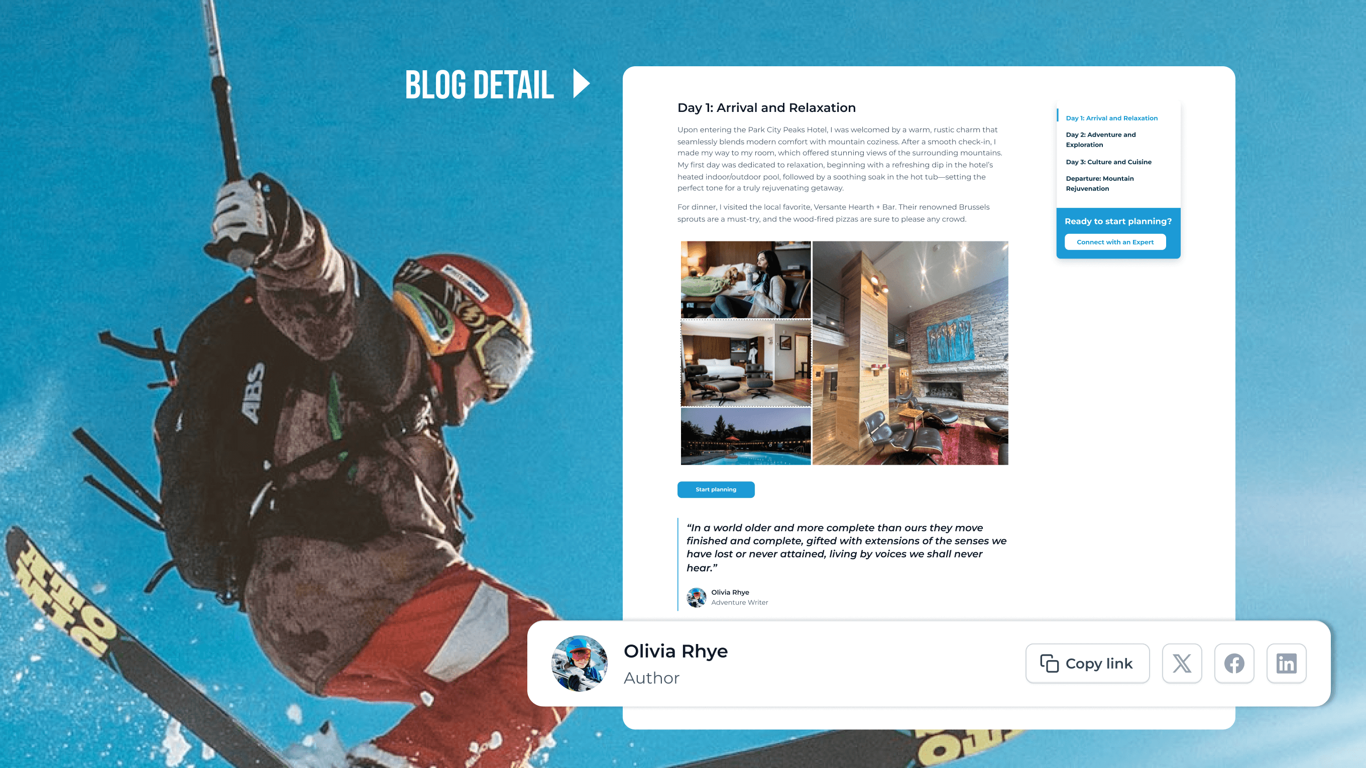
A content-focused refresh for Ski.com’s blog to make trip inspiration more immersive and accessible.
My Responsibility
Role | Main UX/UI Designer |
Scope | UX (Usability analysis, UX audit, Solution ideation), UI (Visual redesign, Layout improvement, Component consistency) |
Team |
|
Goal | Improve content readability and align visuals with the Ski.com brand |
Outcome | Improved user engagement with a modern layout, better navigation, and responsive design. |
Problem
Joining the project in stage 2, after the main website's branding was defined in stage 1, my focus was on revising the Blog page, which had a large amount of content that needed to be revised to match the new branding.
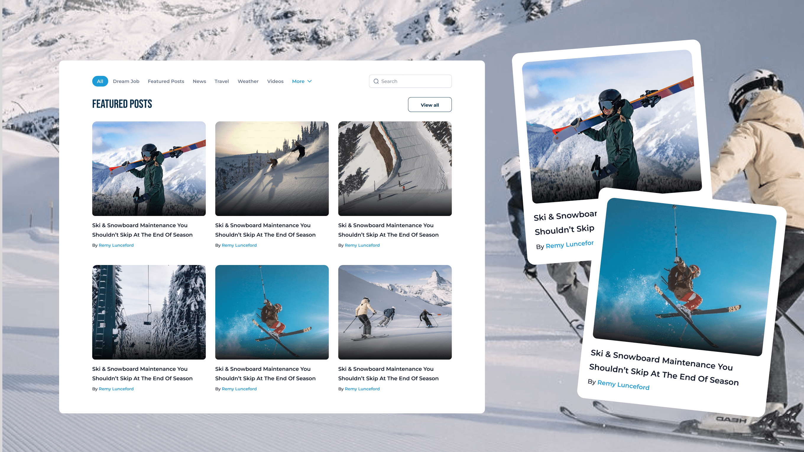
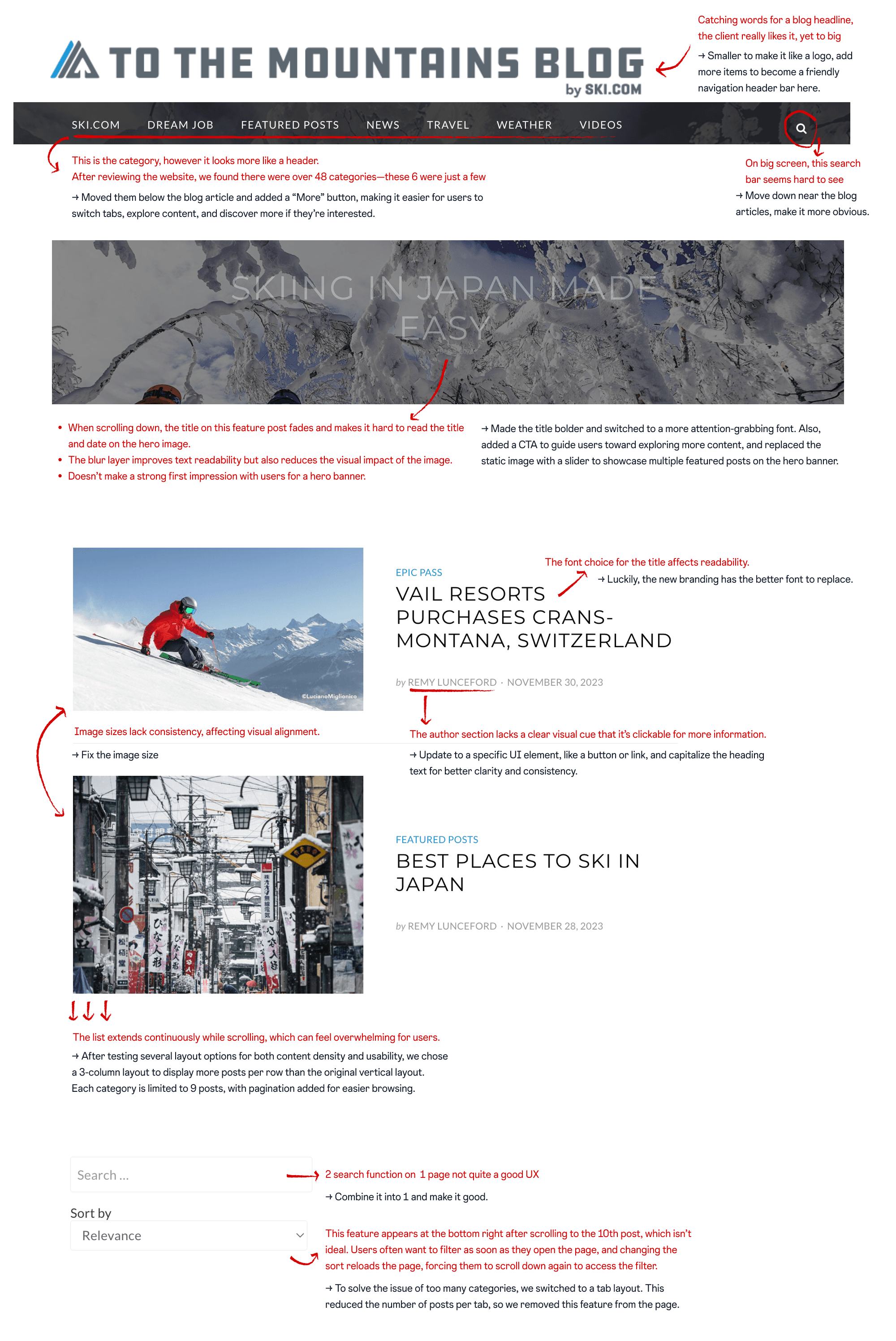
At that time, the site was built primarily as a content hub, presented by treating all blog posts equally, making it difficult for users to identify what’s featured, new, or relevant to their interests.
With no filtering or sorting tools, readers are forced to scroll endlessly, hard-to-scan pages, readers are left with passive consumption instead of real exploration or conversion.
Problem Area | Issue |
|---|---|
No visual priority | All posts look visually similar with no strong visual cues, low hierarchy between content. |
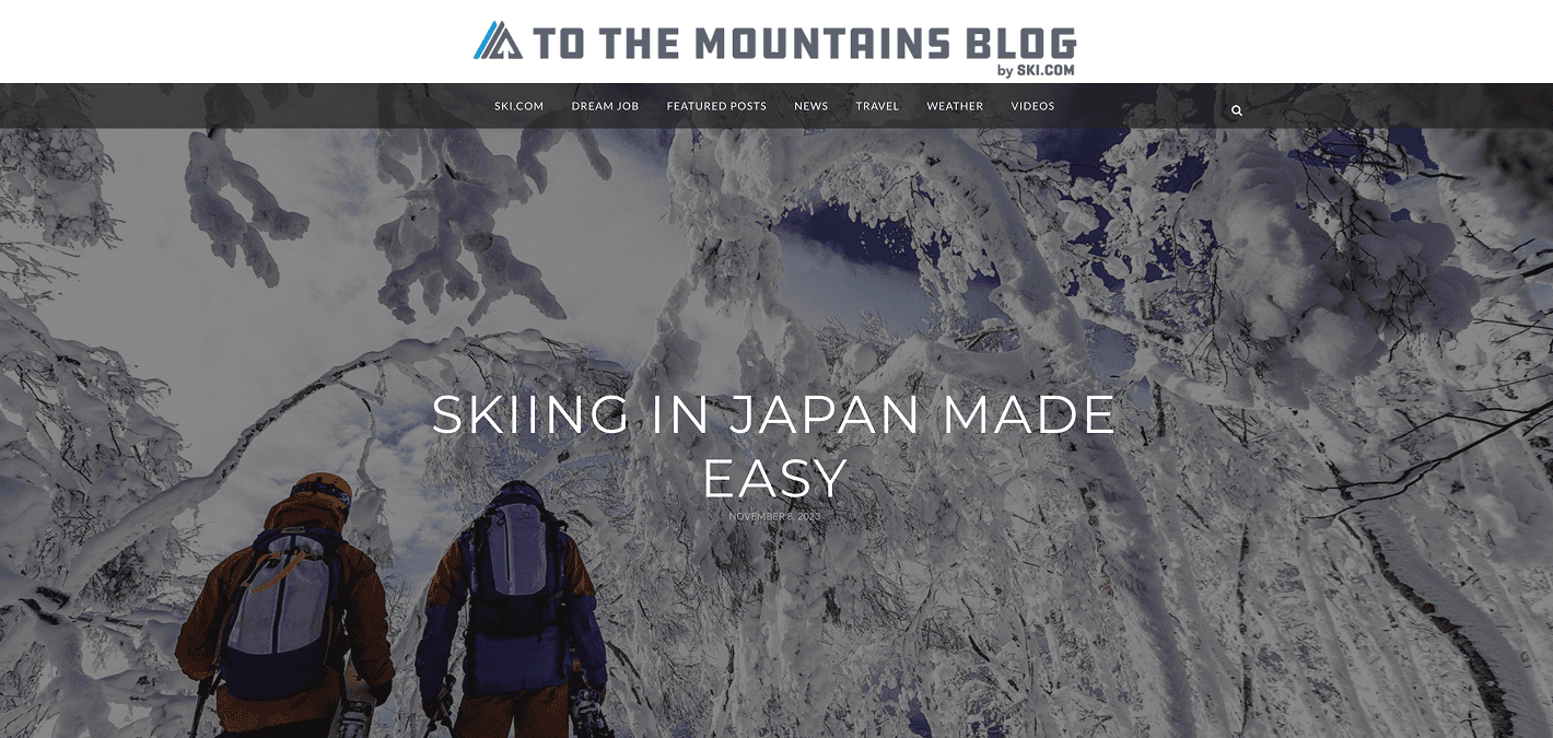
Navigation bar is overloaded | The top menu includes too many items with little differentiation or categorisation, possibly confusing users. |
Search bar placement | Small and tucked in the upper right. Users might ignore it. |
Lack of filters & sorting options | The blog listing lacks user controls like filtering by category, author, despite the large content. |
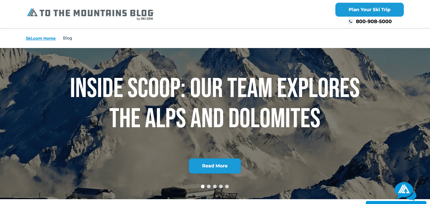
Weak CTAs | There is only one CTA across the site, which does not appeal to users looking for digital engagement right after they scroll through the site. |
Missing interactive | No use of interactive elements like hover effects, video snippets, or carousel previews to increase engagement. |

Solution
The goal is to align the new site with the new brand as the client requested. My solution is to align the UI components with the branding while improving the UX through minor changes for better usability.
Reflections
From a designer’s perspective, rebuilding a website might seem simple. But for developers, it means migrating existing content into a new and improved UI - a task that requires precision and care.
Before redesigning, it’s important to understand exactly what content already exists on the website - analyze the amount, structure, and purpose of each part. Carefully consider whether to keep, remove, or add new elements. Early communication with your team and developers is essential to make informed decisions together.
It can be challenging to balance project budget, client expectations, and your own passion for creating great design. You always want to make it the best it can be, but sometimes, “good enough” is the most practical and suitable solution.
Throughout the project, we explored many design options together. Some designs were visually strong and had good UX, but didn’t get client approval. Others weren’t necessarily outstanding, but made implementation much easier for developers, so we chose the more practical option in the end. We work as a team, and that collaboration is key to making each other’s work smoother and more effective.
More Works
(GQ® — 02)
©2024
FAQ
01
What does a project look like?
02
How is the pricing structure?
03
Are all projects fixed scope?
04
What is the ROI?
05
How do we measure success?
06
What do I need to get started?
07
How easy is it to edit for beginners?
08
Do I need to know how to code?
2024
Ski Blog
The largest provider of ski holiday packages globally, the website aim to position them as the digital leader in the ski holiday industry.
Travel Website
USA
Know More
A content-focused refresh for Ski.com’s blog to make trip inspiration more immersive and accessible.
My Responsibility
Role | Main UX/UI Designer |
Scope | UX (Usability analysis, UX audit, Solution ideation), UI (Visual redesign, Layout improvement, Component consistency) |
Team |
|
Goal | Improve content readability and align visuals with the Ski.com brand |
Outcome | Improved user engagement with a modern layout, better navigation, and responsive design. |
Problem
Joining the project in stage 2, after the main website's branding was defined in stage 1, my focus was on revising the Blog page, which had a large amount of content that needed to be revised to match the new branding.
At that time, the site was built primarily as a content hub, presented by treating all blog posts equally, making it difficult for users to identify what’s featured, new, or relevant to their interests.
With no filtering or sorting tools, readers are forced to scroll endlessly, hard-to-scan pages, readers are left with passive consumption instead of real exploration or conversion.
Problem Area | Issue |
|---|---|
No visual priority | All posts look visually similar with no strong visual cues, low hierarchy between content. |
Navigation bar is overloaded | The top menu includes too many items with little differentiation or categorisation, possibly confusing users. |
Search bar placement | Small and tucked in the upper right. Users might ignore it. |
Lack of filters & sorting options | The blog listing lacks user controls like filtering by category, author, despite the large content. |
Weak CTAs | There is only one CTA across the site, which does not appeal to users looking for digital engagement right after they scroll through the site. |
Missing interactive | No use of interactive elements like hover effects, video snippets, or carousel previews to increase engagement. |
Solution
The goal is to align the new site with the new brand as the client requested. My solution is to align the UI components with the branding while improving the UX through minor changes for better usability.
Reflections
From a designer’s perspective, rebuilding a website might seem simple. But for developers, it means migrating existing content into a new and improved UI - a task that requires precision and care.
Before redesigning, it’s important to understand exactly what content already exists on the website - analyze the amount, structure, and purpose of each part. Carefully consider whether to keep, remove, or add new elements. Early communication with your team and developers is essential to make informed decisions together.
It can be challenging to balance project budget, client expectations, and your own passion for creating great design. You always want to make it the best it can be, but sometimes, “good enough” is the most practical and suitable solution.
Throughout the project, we explored many design options together. Some designs were visually strong and had good UX, but didn’t get client approval. Others weren’t necessarily outstanding, but made implementation much easier for developers, so we chose the more practical option in the end. We work as a team, and that collaboration is key to making each other’s work smoother and more effective.
More Works
©2024
FAQ
What does a project look like?
How is the pricing structure?
Are all projects fixed scope?
What is the ROI?
How do we measure success?
What do I need to get started?
How easy is it to edit for beginners?
Do I need to know how to code?